
Conversion-Focused Web Design: How Layout, Messaging, and CTAs Turn Visitors Into Customers
Conversion-focused web design is the practice of arranging every page so a visitor understands the offer, trusts the business, and takes one clear next step. It works through conversion architecture: a planned order of headline, proof, and call to action, a layout built for the phone first, and forms short enough to finish in seconds.
Most small business websites do not fail because they are ugly. They fail because a visitor cannot quickly tell whether the business solves their problem, and leaves. This hub goes deeper into the conversion layer of our complete guide to marketing-driven web design: how to sequence a page, write calls to action that get pressed, build landing pages, and find the leaks on the pages you already have.
What is conversion architecture?
Conversion architecture is the deliberate structure behind a page that converts: the order of its sections, the job each section does, and where the visitor is asked to act. It treats a web page like a short sales conversation, with each block answering the next question a buyer is likely to have.
A service page answers questions in a predictable sequence. What is this, and is it for me? Why should I believe you? What will it cost me? What do I do now? When sections follow that order, the page feels easy. When it opens with company history, the visitor has to work, and many stop.
Conversion architecture also operates across the whole site. Navigation labels, internal links, and footers decide how quickly someone gets from a blog post to a phone call. We map that route before a design is drawn, so contact is never more than one obvious step away.
Start With the Conversion Goal, Then Build the Page Around It
A page can only be designed to convert once it has a defined conversion. Decide the single most valuable action for each page type first, then arrange the layout, copy, and buttons to serve it.
For a home services company, the primary action is usually a phone call or a quote request; for a professional firm, a consultation booking; for a retailer, a purchase or store visit. Secondary actions, such as reading a guide, downloading a checklist, or joining an email list, still have value, but they should look and sit clearly beneath the primary one.
It helps to write the goal down in a sentence before any design begins: "On the drain cleaning page, a homeowner in Reading should be able to call us within five seconds of arriving." That sentence tells the designer where the phone number goes, the copywriter what the headline must promise, and the analytics setup which action counts as success. Without it, the page ends up asking for everything at once.
Messaging Hierarchy: Headline, Subhead, Proof, Ask
Messaging hierarchy is the order in which a page delivers its message, and on a converting page the headline names the outcome, the subhead adds specifics, proof follows immediately, and the ask comes before the visitor has to scroll for it.
The headline should be written in the customer's words, not the company's. "Emergency Furnace Repair in Berks County, Usually Same Day" beats "Comfort Solutions You Can Trust" because it matches what the searcher typed and tells them they are in the right place. The subhead then answers the obvious follow-up: service area, hours, a price range, or the type of customer you serve.
Proof belongs directly under that message, not on a testimonials page nobody visits. A star rating, a short named review, a license number, or years in business all reduce the risk of contacting you.
Plain language matters at every level. Short sentences and scannable subheads let a busy homeowner understand the offer in one pass. If a sentence needs to be read twice, it is likely costing you inquiries.
Website Layout That Converts on a Phone First
A website layout that converts is designed for the phone first, because that is where most local buyers meet the business. According to the Pew Research Center's Mobile Fact Sheet (published November 20, 2025), 91% of U.S. adults own a smartphone, up from 35% in Pew's first smartphone survey in 2011.
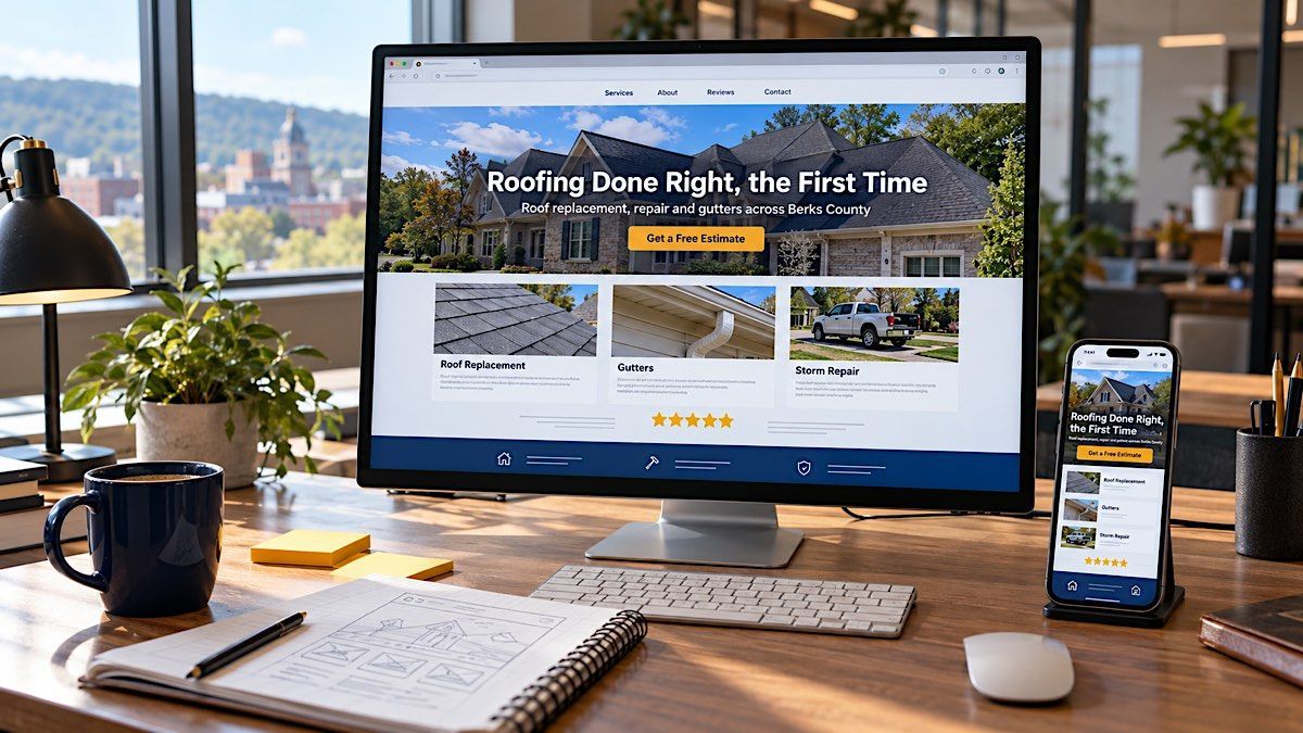
Phone-first layout changes specific decisions. The headline and primary button must fit on the first screen of a small device. The phone number should be tappable and repeated in a slim bar that stays reachable while scrolling. Long text becomes short sections, and images are cropped so the subject still reads at phone width.
Buttons need room for a thumb. The W3C's accessibility standard sets a minimum target size of 24 by 24 CSS pixels for pointer targets in WCAG 2.2 Target Size (Minimum), with spacing exceptions. We treat that as a floor: primary buttons should be much larger and set apart from nearby links.
How do you design a call to action that gets clicked?
A call to action gets clicked when the visitor can see it instantly, understands exactly what happens next, and feels the step is low-risk. Good CTA design combines a specific label, strong visual contrast, sensible placement, and a short line of reassurance beside the button.
The label should describe the outcome, not the mechanism. "Get My Free Quote" tells the visitor what they receive; "Submit" and "Click Here" do not. Where it fits, add a response promise beneath the button, such as "We reply within one business day."
Contrast is what makes a button findable. The W3C's WCAG 2.2 contrast minimum requires a ratio of at least 4.5:1 for normal text, and button labels should meet it against the button color. Reserve your strongest brand color for the primary action and use a quieter outline style for secondary actions, so the two never compete.
Placement follows the reading path. Put the primary CTA in the first screen, repeat it after each major section where a reader may be ready, and close the page with it. Repetition is not pushiness when every instance offers the same single step.
Forms, Friction, and the Final Step Before Contact
Every field, choice, and surprise between "I'm interested" and "I've sent it" is friction, and friction is where conversions are lost. The fix is to ask only for what you need to respond and to make the form look as short as it is.
In its checkout form field research (published June 26, 2024), the Baymard Institute found the average e-commerce checkout contained 11.3 form fields, and that 17% of users had abandoned an order because of checkout complexity. A service inquiry is simpler than a checkout, but the lesson carries over: fewer fields usually means more finished forms.
For most local service businesses, name, phone or email, and a short "how can we help" box are enough to start a conversation. Address, budget, and project timing can wait for the follow-up call. Label fields above the input, show errors beside the field that caused them, and end on a confirmation page that says what happens next. That page also gives your tracking a clean lead signal.
What makes a good landing page design for local services?
Good landing page design for local services narrows a page to one audience, one offer, and one action. It matches the promise that brought the visitor there, removes distractions, and backs the offer with local proof.
A landing page is different from a service page. A service page serves everyone who might need that service and links freely to the rest of the site. A landing page is built for one campaign, promotion, or audience, so it usually drops the full navigation and keeps the visitor focused on the offer.
The strongest local landing pages share a few traits. The headline repeats the exact offer and the town or region. The first screen shows a reason to act now, such as an inspection slot, a seasonal price, or a guarantee. Proof is local and specific, with reviews from nearby customers or photos of recognizable work. Objections that usually stop a call, such as financing, service area, or response time, are answered on the page rather than left for a phone call that never happens.
A Local Example: How PMI Routes Visitors to the Right Office
Our own site is a practical example of conversion architecture for a business with two service territories. Instead of one generic phone number, the contact page routes each visitor to the office that covers their area, and the regional web design pages speak to each territory directly.
The contact page explains that the Reading office covers Berks County and the Allentown office covers the Lehigh Valley, then lists the towns each serves, from Wyomissing and Kutztown to Bethlehem and Emmaus, with that office's phone number beside them. A visitor from Boyertown never has to guess which number to call.
The web design service page follows the same hierarchy described above. The first screen states who we serve and where, places a "Get a Free Web Design Consultation" button, and puts the review rating and a client testimonial directly beneath it. Regional pages, such as web design in Berks County, then speak to that market specifically. A contractor with crews in both Berks County and the Lehigh Valley could apply the same pattern: one site, a clear route to the right office, and proof that matches the visitor's town.
How to Audit Your Own Pages for Conversion Leaks
You can find most conversion leaks yourself by reviewing your top pages the way a first-time visitor would, on a phone, with a stopwatch and a checklist. Start with your highest-traffic pages, where a small improvement pays back fastest.
Work through each page with these checks:
- The five-second test. Show the first screen to someone unfamiliar with your business for five seconds. Can they say what you do, where, and what to do next?
- The thumb test. On your own phone, try to call or request a quote with one hand. Count the taps and note anything you missed or mis-tapped.
- The proof check. Is there a review, rating, credential, or real photo within sight of every primary button?
- The form check. Remove any field you do not need before the first conversation, then submit the form and read the confirmation page as a customer.
- The competition check. Compare your first screen with the top three competitors in your search results. Note who answers the visitor's questions faster.
Record each change and its date, so you can compare inquiry volume before and after.
Turn More of Your Visitors Into Customers
Traffic only becomes revenue when the pages people land on make the next step clear, credible, and easy. If your website gets visits but too few calls or quote requests, its conversion architecture is the first place to look, and it is often the fastest gain available. Explore PMI's marketing-driven web design services, then contact us online or call our Reading office for Berks County at (484) 297-6395 or our Allentown office for the Lehigh Valley at (484) 838-6648 to request a free review of your highest-traffic pages.
Frequently Asked Questions
Where should the call to action go on a web page?
Place the primary call to action in the first screen, where it is visible without scrolling, then repeat the same action after each major section where a reader may be ready to decide, and again at the end. On phones, a slim, persistent call or quote bar keeps the action within reach. Every instance should offer the same single step.
How many calls to action should a page have?
A page should have one primary call to action, which can appear several times, plus at most one or two clearly secondary options. Problems start when a page offers several different actions at equal visual weight, such as call, chat, subscribe, and download, because the visitor has to choose instead of act. Give the main action your strongest color.
What is the difference between a landing page and a home page?
A home page introduces the whole business to many kinds of visitors and links to every major section of the site. A landing page is built for one audience and one offer, often tied to a specific campaign or promotion, and usually removes the main navigation so attention stays on a single action. Each has a distinct job.
How do you know whether a design change improved conversions?
Compare a clearly defined conversion, such as form submissions or tracked calls, over similar periods before and after the change, and note any shifts in traffic volume or source that could explain the difference. Low-traffic sites may need several weeks of data before a trend is meaningful. Change one major element at a time so the result is easier to attribute.
Alan Robezzoli is the Founder and President of Power Marketing International, which he started in 2011 to bring 30 years of integrated systems-and-marketing discipline to small and mid-sized businesses across Berks County and the Lehigh Valley. A former software architect, IT executive, and apparel industry marketing executive, he holds an MBA from Mount Saint Mary's University and personally leads the conversion strategy behind every PMI website.