The PMI Blog - Tips You Can Use!
→ Helpful tips for marketers and business owners in plain English with no smoke and mirrors!
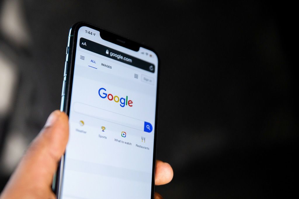
What is local SEO and how can it boost your business? Find out the latest tips and insights to improve your online visibility from Power Marketing International.

Advertising and marketing share similar objectives, but they’re deployed differently by brands — and serve different purposes.
Struggling to get results from your marketing strategy? Take a look at incorporating our creative advertising ideas into your brand's next campaign!

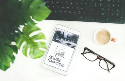
A great website is a powerful tool for attracting, engaging, and converting visitors into leads and customers. Here are 10 ways to make it happen!

Learn the Basics on How to Optimize Your Blog Posts to Achiever Better Search Results and More Traffic to Your Website.

Discover On-Page, Off-Page, and Local SEO Strategies to Help Your Products and Services to Appear on Google Page 1.
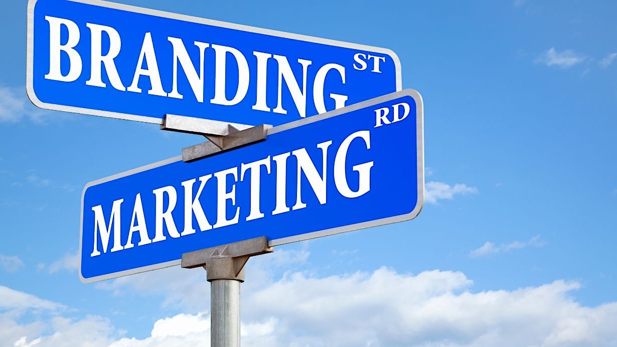
Learn About Branding vs Marketing, Including the Differences Between the Two, and How They Interact.
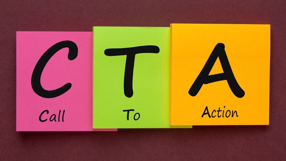
Explore the Different Types of CTAs, Their Importance in Boosting Conversion Rates, and How to Create Compelling CTAs. Let’s Learn!

The Landing Page vs Website Debate Rages On, But Which One is Really Better for Your Online Presence?
What is local SEO and how can it boost your business? Find out the latest tips and insights to improve your online visibility from Power Marketing International.
Advertising and marketing share similar objectives, but they’re deployed differently by brands — and serve different purposes.
Struggling to get results from your marketing strategy? Take a look at incorporating our creative advertising ideas into your brand's next campaign!
A great website is a powerful tool for attracting, engaging, and converting visitors into leads and customers. Here are 10 ways to make it happen!
Learn the Basics on How to Optimize Your Blog Posts to Achiever Better Search Results and More Traffic to Your Website.
Discover On-Page, Off-Page, and Local SEO Strategies to Help Your Products and Services to Appear on Google Page 1.
Learn About Branding vs Marketing, Including the Differences Between the Two, and How They Interact.
Explore the Different Types of CTAs, Their Importance in Boosting Conversion Rates, and How to Create Compelling CTAs. Let’s Learn!
The Landing Page vs Website Debate Rages On, But Which One is Really Better for Your Online Presence?

Customer Loyalty is loyalty to a product (based on pricing, customer service, etc.). The key to growing your business is brand loyalty (based on feelings).